
Why Black Ink in Tattoos Matter
- Gifford Kasen

- Jul 26, 2019
- 4 min read
Updated: Aug 11, 2025
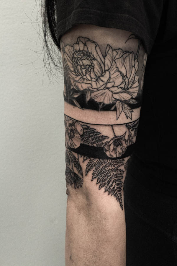
I’m going to throw down a strongly opinionated statement here and say that 98 percent of tattoos should have black in them. Be it in the outline to illustrate the subject matter, in the edging and shadows to define a realistic styled piece, or in abstract patterns and lines in strictly ornamental tattoos. Why? Because it just reads better. And probably holds up better as well! In five years when all those nice color fades start to blend and lose some of their luster, or that soft grey wash lightens up a few shades, that black is what is going to hold your piece together.
Your tattoo will not always look as vibrant as when it is just finished
Whether doing color, black and grey, realism, or just blackwork style tattoos, the use of black to provide a strong contrast and backbone of the design is crucial. Why is this? Well tattooing is a complicated medium with a lot of limitations. Pigments that are brightly colored in the ink bottles may heal under the skin much duller, or may disappear altogether after a couple seasons of ultraviolet light exposure. The actual biology of what happens to tattoo ink once deposited in the skin is still being understood to a degree (check out these articles linked at the end of the post for a more detailed explanation) edit circa 2025, there is currently much better information on how tattoo ink is held in the skin then there was when this post was originally written. Check out some more up to date information here but from an anecdotal perspective, most tattoo artists who have been around for a while tend to agree that black ink tends to migrate less and keep a design looking sharper. Tattoos without any black tend to look washed out and difficult to read after they heal. This is not to say that all tattoos need a black outline, but any artists doing a tattoo without an outline should be able to use black within the design in a calculated effort to provide a dynamic range of values as well as long term readability.
Why is value contrast needed in good tattoo design? How does Black ink help?
Working on skin involves working in a limited value range. After the tattoo is applied and several layers of skin heal over it, you are actually looking through the natural pigment of the wearers skin to view the tattoo. What does that mean? In the simplest terms the darker the natural skin pigment is the more it will obscure the tattoo pigment in the skin. Even the lightest skin will still obscure the tattoo to some level. Selective use of black as the darkest value, and skin tone as the lightest value (white ink healed under skin will actually be darker than the natural skin done when it settles in over time) will give you the strongest design possible. There are of course a huge number of variables, as well as personal preferences as to what makes a strong design, and the right design for the wearer of the piece. But generally speaking, a design that has strong contrasts will not only read well initially, but over time as the tattoo ages. Tattoo design from solid blackwork to portraits and realism benefit from a intentional use of black ink in order to make the design pop
When to not use black ink in a tattoo
There are exceptions to the rule of using black, of course. Cosmetic tattooing uses more natural skin tones or a lighter pigment load to simulate naturally occurring markings on the body, or subtle makeup. In this exception though we find the rule. If you were to apply a more complicated design in this matter, without the use of strong contrast (black) it would run the risk of looking more like a skin disorder than a well executed tattoo design. There are also some artists doing very large and bold designs, usually of just one or two solid colors, and it could be argued that those large scale designs provide enough contrast on their own that black is not needed. Maybe. As in all rules of design, once you understand them, you can push the boundaries a bit. In general though, if you want a palm sized, softly rendered watercolor style tattoo, you should listen to your artist when they say it should have some black in it to anchor the piece with contrast. A skilled artist in this style should be able to do this while still preserving the soft look one is going for.

I hope this has been an informative read! As always if you have any follow up questions or objective disagreements, I would love to hear them either in a comment or a message to the studio.
-Gifford
Here's links to a couple articles explaining what happens when tattoo pigment is put in your body. A pretty interesting read if you have the time!


Comments